
✦ Concept & Vibe: After Hours at the Estate
This shoot was built around the idea of a surreal, invite-only gathering that unfolds across a historic estate sometime between dusk and dawn. The tone is “sophisticated surrealism”- not traditional cocktail culture, not wellness-core, but something stranger and more cinematic.
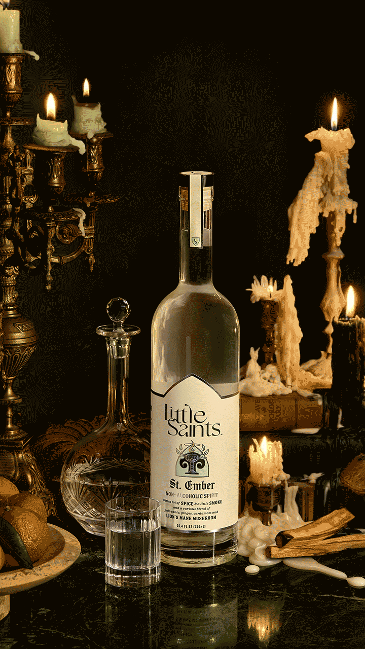
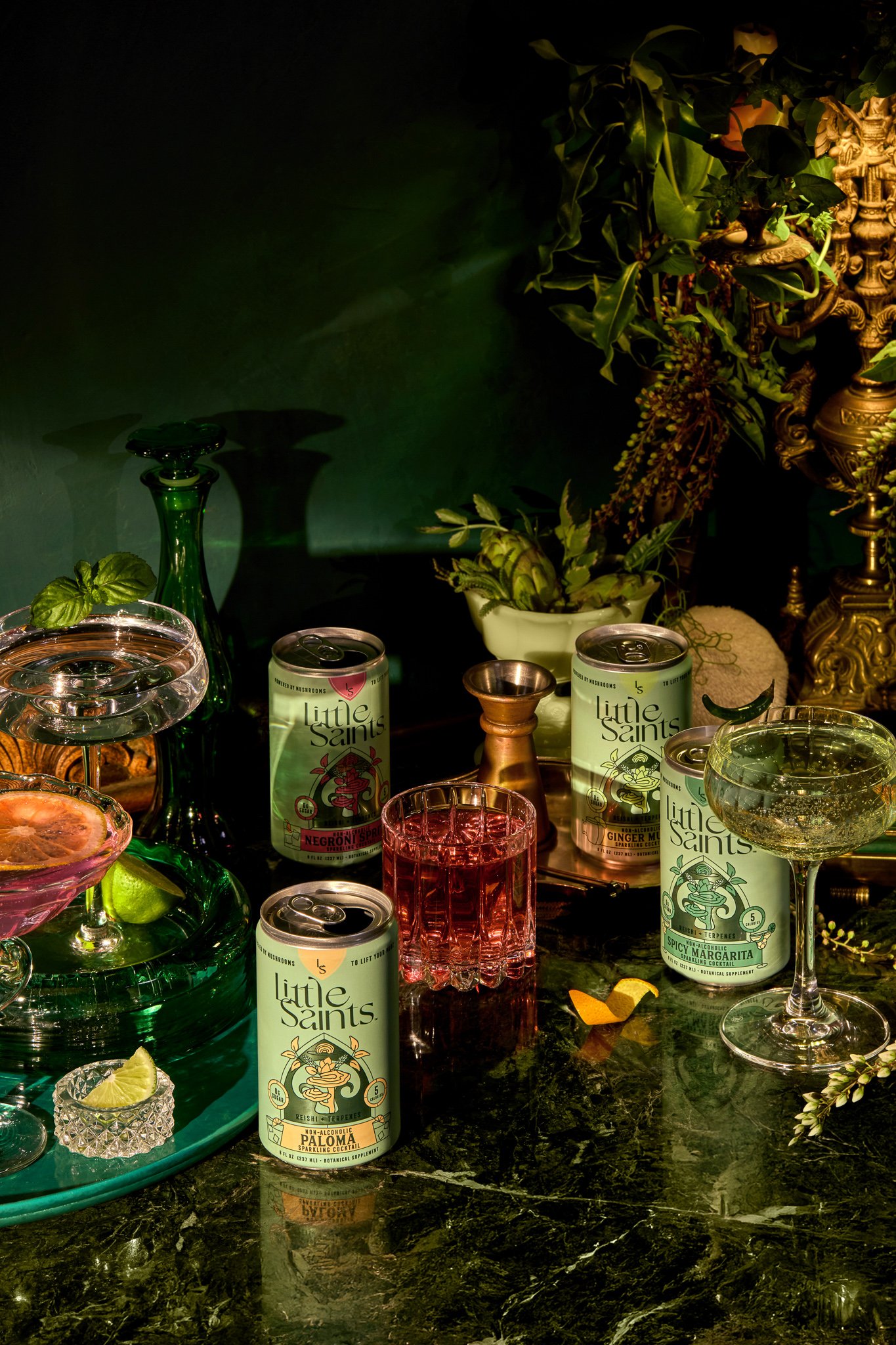
We designed the world to feel curated but lived-in. Lighting was motivated by lamps, moonlight, and candlelight. Scenes were styled to suggest people had just stepped away, glassware half-full, shoes kicked off, garnishes mid-use. Everything intentional.
Our job was to make that world feel real, and make Little Saints feel at home inside it.


Easter Eggs & Art References
We layered in subtle visual references, tucked into the background as texture for those who look closely.


Book titles in the background have been altered to their tagline of “enclave for the unordinary”, the LS logo embossed on another, and the founder’s name as one of the authors
Dutch still life motifs like busts, a key, nautilus cup, and candles: all symbols that nod to enlightenment, growth, evolution, and alignment.
Custom cyanotypes created using the terpene ingredients from the drinks, used as layered props throughout the scenes.
Reishi and lion’s mane mushrooms find their way into the scenes in architectural and organic ways - growing out of a coffee table or attached to a melting bronze bust
All of these references helped make the world feel stranger, deeper, and more specific.


Levity is a fictional game we created as a narrative prop - an intimate, two-player diversion built around a modified solitaire game (rumored to have started in a 1920s social club). We chose it for its timelessness: familiar enough to blend into a vintage setting, but easily adapted to carry new meaning. The custom cards feature abstract symbols with layered meanings, some of which show up again as drink garnishes. It’s a small detail, but it ties the game back into the world around it.


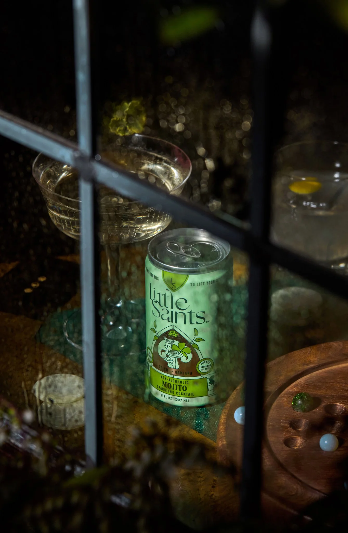
Even in PDP-style compositions, we designed a set up that would blend with the world we created, so that a can or bottle still felt like part of a story, not just a catalog shot.


We lit and styled the ingredients to feel like art objects. It was about texture, shadow, and giving what’s inside the can the same presence as everything in the scenes.


